Declarative UI Modules
These modules are a way to easily create a simple form interface, to be displayed in the frontend, that allows users to fill in the input parameters necessary to execute a function module and get its output. They are created by declaring in the config file what should be rendered instead of programming custom React components, hence the name. Their config contains the following fields:
- id [required]: string to identify the module within the extension.
- type [required]: "interface-declarative", for declarative UI modules.
- subtype [required]: the type of UI module, which dictates where it will appear in the frontend. Right now, the only one supported is "scenario-popup", to make the UI module accessible from the scenario editing page.
- bindsTo [required]: the id of the function module to run when the form is submitted.
- displayName: user-friendly string that appears in the menus and as the header of the UI module.
- ui: object that describes how the interface itself should be built, with itself being composed of several fields:
- submitLabel: user-friendly string that appears as the label of the "submit" button in the interface.
- result: object that describes the result (output) of the execution of the function module (the one identified in the "bindsTo" field). It is composed of a type field, which can be "json" or "file". If the type is "file", the following fields are also used:
- contentType [required]: string representing the MIME type of the file (example: "application/zip")
- defaultFileName: default file name used when the user downloads the file.
- parameters: array of objects where each one represents one parameter input to render in the interface. Several types are supported (listed below), but they all have in common the following fields:
- name: name of the parameter. It must match with the name of a variable in the inputClass of the function module that is executed (the one identified in the bindsTo field).
- type: type of parameter (example: "boolean", "selectSingle"). The full list of supported types is listed below, alongside their specific fields.
Types of parameters
- Boolean: true/false value, rendered as a switch in the frontend
- type [required]: "bool"
- label: user-friendly string of text displayed next to the switch
- defaultValue: default value for this parameter (true/false)
- Text: string (text) value, rendered as a text input in the frontend
- type [required]: "text"
- label: user-friendly string of text displayed next to the text input
- defaultValue: default value for this parameter
- required: true/false whether this value is mandatory to fill (default: false)
- minLength: minimum amount of characters in the string
- maxLength: maximum amount of characters in the string
- pattern: regular expression that this parameter's value must match
- Number: numerical (integer or float) value, rendered as a number input in the frontend
- type [required]: "number"
- label: user-friendly string of text displayed next to the number input
- defaultValue: default value for this parameter
- required: true/false whether this value is mandatory to fill (default: false)
- integer: true/false whether this value is an integer or not (default: false)
- minimum: minimum value of the number
- maximum: maximum value of the number
- step: controls the increments of the number input in the frontend
- Single Selection: select one item from a list, rendered as a dropdown in the frontend
- type [required]: "selectSingle"
- label: user-friendly string of text displayed next to the dropdown
- defaultValue: default value selected for this parameter
- values [required]: array of objects that correspond to the options to select from. These objects are of the format:
- value: the value itself, that is passed onto the function module
- label: user-friendly version of the value (can be the same)
- Multiple Selection: select zero or more items from a list, rendered as a dropdown in the frontend
- type [required]: "selectMulti"
- label: user-friendly string of text displayed next to the dropdown
- defaultValues: array of strings corresponding to the values selected by default for this parameter
- minSelected: minimum amount of items to be selected
- maxSelected: maximum amount of items that can be selected
- values [required]: array of objects that correspond to the options to select from. These objects are of the format:
- value: the value itself, that is passed onto the function module
- label: user-friendly version of the value (can be the same)
- Context: these parameters are "special" in the sense that they are not user-inputted, but instead filled in by the application itself. They are used for special values, such as the scenario id or the version id.
- type [required]: "context"
- key [required]: "scenarioId" or "versionId"
Config examples
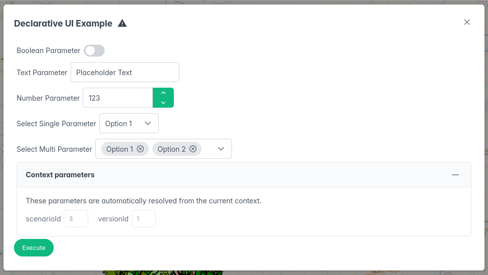
Here is an example of a declarative UI module with parameters of each type:
{
  "id": "full-declarative-ui-example",
  "type": "interface-declarative",
  "subtype": "scenario-popup",
  "displayName": "Declarative UI Example",
  "bindsTo": "hello-function",
  "ui": {
    "submitLabel": "Execute",
    "result": {
      "type": "json"
    },
    "parameters": [
      {
        "name": "boolParam",
        "type": "bool",
        "label": "Boolean Parameter",
        "defaultValue": false
      },
      {
        "name": "textParam",
        "type": "text",
        "label": "Text Parameter",
        "defaultValue": "Placeholder Text",
        "required": true,
        "maxLength": 20
      },
      {
        "name": "numberParam",
        "type": "number",
        "label": "Number Parameter",
        "defaultValue": 123,
        "required": true,
        "integer": true,
        "maximum": 1000
      },
      {
        "name": "selectSingleParam",
        "type": "selectSingle",
        "label": "Select Single Parameter",
        "defaultValue": "option1",
        "values": [
          {"value": "option1", "label": "Option 1"},
          {"value": "option2", "label": "Option 2"},
          {"value": "option3", "label": "Option 3"}
        ]
      },
      {
        "name": "selectMultiParam",
        "type": "selectMulti",
        "label": "Select Multi Parameter",
        "defaultValues": ["option1", "option2"],
        "values": [
          {"value": "option1", "label": "Option 1"},
          {"value": "option2", "label": "Option 2"},
          {"value": "option3", "label": "Option 3"}
        ]
      },
      {
        "name": "scenario",
        "type": "context",
        "key": "scenarioId"
      },
      {
        "name": "version",
        "type": "context",
        "key": "versionId"
      }
    ]
  }
}
This produces the following form interface (please note that the "Context parameters" section is only displayed to admins, not regular users):
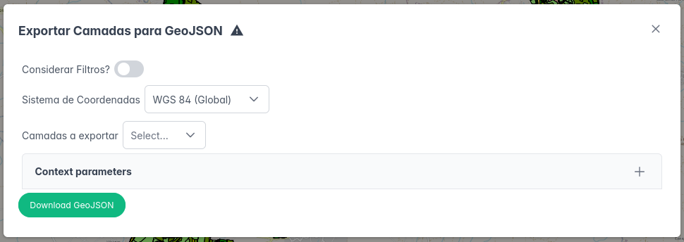
Another example, coming from the GeoJSON Export extension. In this case, the output is a (zip) file, so the button will trigger the execution of the geojson-function module and then the download of its output file.
{
  "id": "geojson-export-popup",
  "type": "interface-declarative",
  "subtype": "scenario-popup",
  "displayName": "Exportar Camadas para GeoJSON",
  "bindsTo": "geojson-function",
  "ui": {
    "submitLabel": "Download GeoJSON",
    "result": {
      "type": "file",
      "contentType": "application/zip",
      "defaultFileName": "geojson-export.zip"
    },
    "parameters": [
      {
        "name": "scenario",
        "type": "context",
        "key": "scenarioId"
      },
      {
        "name": "version",
        "type": "context",
        "key": "versionId"
      },
      {
        "name": "filtered",
        "type": "bool",
        "label": "Considerar Filtros?",
        "defaultValue": false
      },
      {
        "name": "crs",
        "type": "selectSingle",
        "label": "Sistema de Coordenadas",
        "values": [
          {"value": "EPSG:4326", "label": "WGS 84 (Global)"},
          {"value": "EPSG:3763", "label": "ETRS89 / Portugal TM06"}
        ],
        "defaultValue": "EPSG:4326"
      },
      {
        "name": "layers",
        "type": "selectMulti",
        "label": "Camadas a exportar",
        "values": [
          {"value": "POSA", "label": "POSA"},
          {"value": "POSP", "label": "POSP"},
          {"value": "Unidades de Transformação", "label": "Unidades de Transformação"},
          {"value": "Serviços de Ecossistemas", "label": "Serviços de Ecossistemas"}
        ],
        "minSelected": 1
      }
    ]
  }
}
This produces the following interface: